 |
|
Desktop
Development » Edit Controls » Masked
and Validating controls
Intermediate License: The Code Project
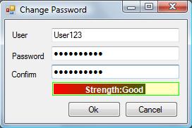
Open License (CPOL) Password Strength ControlBy Tharindu Nishad PatikirikoralaThis article is about a Password Strength control, which can be used in password dialogs and login windows in Windows based .NET applications. If you want, you can use it as a progress bar control as well. This control can be shaped to different styles and can be extended, if needed. |
C# (C# 1.0, C# 2.0, C#
3.0, C#), .NET (.NET, .NET 2.0), Dev, Design Posted: 21 Jul 2008 Updated: 21 Jul 2008 Views: 1,397 | ||
|
| |||
|
|
| ||||||||||||||||

Introduction
This article is about a Password Strength control, which can be used in password dialogs and login windows in Windows based .NET applications. If you want, you can use it as a progress bar control as well. This control can be shaped to different styles and can be extended, if needed.
Background
Custom control design is one of the fascinating features given by the .NET framework to control authors. Using inheritance, we can extend the behavior or the look and feel of preexisting Windows Forms controls. In addition, because of the flexibility given to authors, they can give designers good design time experience using property grids and other means. There are lots of controls with similar features in the web using the power of JavaScript and AJAX, but I was not able to find such a control for Windows based applications. Because of this, I decided to create this control, which I believe has very good value.

You can use this control mainly in Change Password windows and in Login dialog boxes to show the strength of the input password. Using the security policy of the company, given a password, you can decide a mark for the strength of that password. In my demo application, I have used a one password strength algorithm to show the power of this control. In addition, you can divide the entire strength range in to several segments and name those as you wish. In my demo application, I have used ranges like Short, Weak, Good, and Strong.
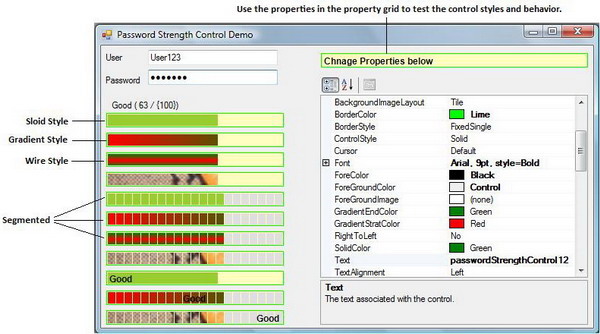
What are the styles available in this control? Using the
ControlStyle property, you can change the styles.
|
Style |
Description |
|
|
Strength indicator bar is drawn with a solid (single) color. |
|
|
Strength indicator bar is drawn with two colors having a
horizontal gradient. ( |
|
|
Strength indicator bar is drawn with two colors having a vertical
gradient. ( |
|
|
Strength indicator bar is drawn using an input image.
( |
Using the same styles, you can change the control behavior and look and
feel to a segmented mode using the EnableSegment property.
Furthermore, you have to set the properties like SegmentGap
and SegmentWidth to customize this mode.
To change the alignment of the text, you can use the
TextAlignment property which has options like
Left, Right, Center, and
None. You can also change the border color and background
images.
Control Implementation
The Password Strength control is an extension of the
System.Windows.Forms.Control class. Even though this has a
similar look and feel as the ProgressBar control, I avoided
extending it because the behavior and some of the visual effects had to be
developed from scratch. In fact, the usage of this control is completely
different from that of the ProgressBar control.
The main implementation is in the Draw method. When the
control is refreshed or repainted, this method will be called. There, I
have divided the implementation into three methods. They are
DrawBorder, DrawBackgorund, and
DrawText. Out of these methods, I am going to discuss only
the most important method.
In the DrawBackgorund method, when the control is in the
segmented mode, I draw a region with segments, or in other words, like a
scale.
Region region = new Region();
Rectangle segmentRect = new Rectangle(InnerRectangle.Left, InnerRectangle.Top,
                                      swidth, InnerRectangle.Height);
for (int i = 0; i < segmentNumber; i++) {
  region.Union(segmentRect);
  segmentRect.Offset(swidth + gap, 0);
}
I used this code snippet to create a segmented region just like a
scale. Then, using the FillRegion method in the
Graphics class, I filled the segmented region using different
brushes.
Other important implantations are the DrawWire and
DrawGradient methods used in this control. For this,
different brushes like TextureBrush,
LinearGradientBrush, and SolidBrush provided by
the System.Drawing namespace were really useful.
LinearGradientBrush gradientBrush = new LinearGradientBrush(
 new Point(rc.X, rc.Y),
 new Point(rc.X + rc.Width, rc.Y),
 this.gradientStratColor,
 this.gradientEndColor);
I used the LinearGradientBrush to create the gradient when
the control is in the Gradient style. Here, when strength
increases, the gradient increases as well. Use this brush for
FillRectangle or FillRegion to paint the surface
accordingly.
In the DrawWire method, I used another
GradientBrush with the color blend option to enable
multi-color gradient in the vertical direction.
LinearGradientBrush gradientBrush = new LinearGradientBrush(
  new Point(rc.X, rc.Y),
  new Point(rc.X, rc.Y + rc.Height),
  this.gradientStratColor,
  this.gradientEndColor);
ColorBlend colorBlend = new ColorBlend(3);
colorBlend.Colors = new Color[] { this.gradientEndColor,
           this.gradientStratColor, this.gradientEndColor };
colorBlend.Positions = new float[] { 0, (float)0.4, 1 };
gradientBrush.InterpolationColors = colorBlend;
When designing a control, we have to consider the properties we are
going to expose to the propertygrid and other external entities. Using the
attributes given by the System.ComponentModel namespace, we
have the flexibility to selectively expose the things we want. For
instance, the Browsable (bool) attribute can be used to avoid a
specific property being displayed in the property window. In the following
table, you can find the meaning of the attributes I have used:
|
|
Indicates whether a property or an event should be displayed in the Properties window. |
|
|
Provides the name of the category to which a property or an event belongs to. This allows for logical grouping of properties and events. |
|
|
Used to provide a default value for a control property. If the property doesn't have a simple type, a type converter is needed. |
|
|
Provides a description of a property or an event. The text is displayed at the bottom of the Properties window when the user selects a property or event. |
Apart from these, I have used:
[ToolboxItem(true)]
[ToolboxBitmap(typeof(ProgressBar))]
[Description ("Password Strength Control with different styles.")]
Attributes which will be used by the Toolbox when you add this to the VS2005 Toolbox:
|
|
Provides a base implementation of a toolbox item. |
|
|
Allows you to specify an icon to represent a control in a container, such as the Microsoft Visual Studio Form Designer. |
I created a new event called StrengthChangedEventHandler
to notify the users that the strength value or the text of the control has
changed. This event provides a StrengthChangedEventArgs type
of EventArgs with the respective strength value and text.
If you want to extend this control, you can do that by easily overriding the existing method implementations in any way suitable.
Discussions and Feedback
![]() 2 messages have been posted for this article. Visit http://www.codeproject.com/KB/edit/PasswordStrengh.aspx
to post and view comments on this article, or click here
to get a print view with messages.
2 messages have been posted for this article. Visit http://www.codeproject.com/KB/edit/PasswordStrengh.aspx
to post and view comments on this article, or click here
to get a print view with messages.
| PermaLink
| Privacy | Terms of
Use Last Updated: 21 Jul 2008 Editor: Smitha Vijayan |
Copyright 2008 by Tharindu
Nishad Patikirikorala Everything else Copyright © CodeProject, 1999-2008 Web09 | Advertise on the Code Project |